This started as a focused exercise in building a tactical shooter map, but it quickly became a lesson in how much work needs to happen before a blockout ever feels playable. My goal was to get better at 2D layouts, learn practical shooter metrics, and understand how elevation, cover, route pressure, and bomb-site structure all work together.
The biggest takeaway was simple: a layout is not just a drawing of the map. It is the first place to test the rules of the space.
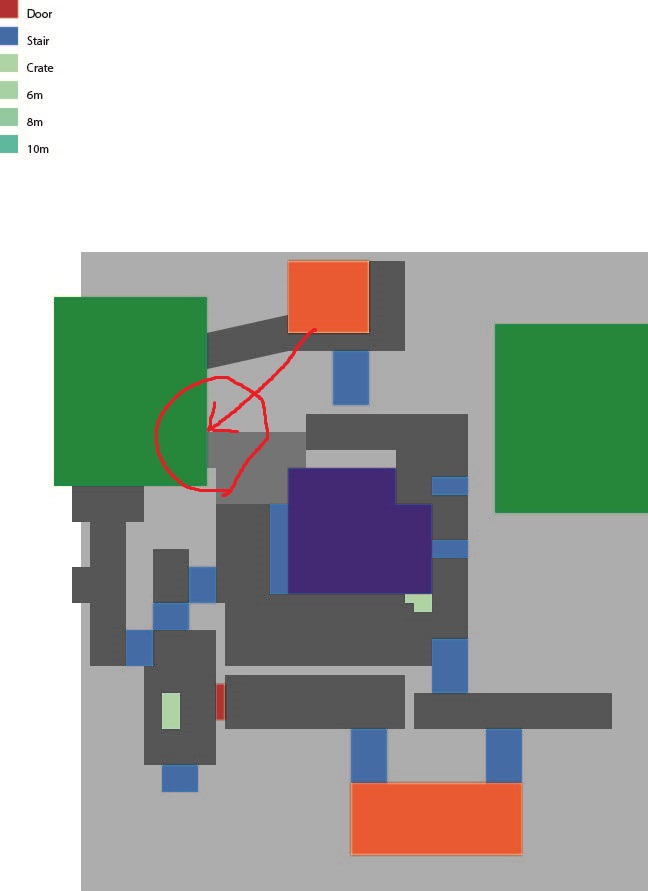
2D Layout
I began by trying to create a 2D layout, but because this was my first tactical shooter map, I was overwhelmed by how many details needed to be considered at once. Instead of using the layout to solve design problems early, I built the blockout first and traced over it afterward.
That was the wrong order.
The 2D layout should have been where I tested rotations, sightlines, site access, choke points, elevation changes, and team flow before committing time to the blockout. In a production environment, that planning pass also helps other disciplines understand the direction earlier. Art, design, and production can start asking better questions when the map’s intent is clear.
Because I moved into blockout too quickly, some issues were harder to fix later. One example was the connector from mid to B site, where the route shape and spacing could have been solved much faster in the layout phase.
For the next map, I would spend more time defining the theme, game mode needs, key landmarks, major callouts, and gameplay objects before touching the blockout. That would make the blank layout less intimidating and give every space a clearer job.
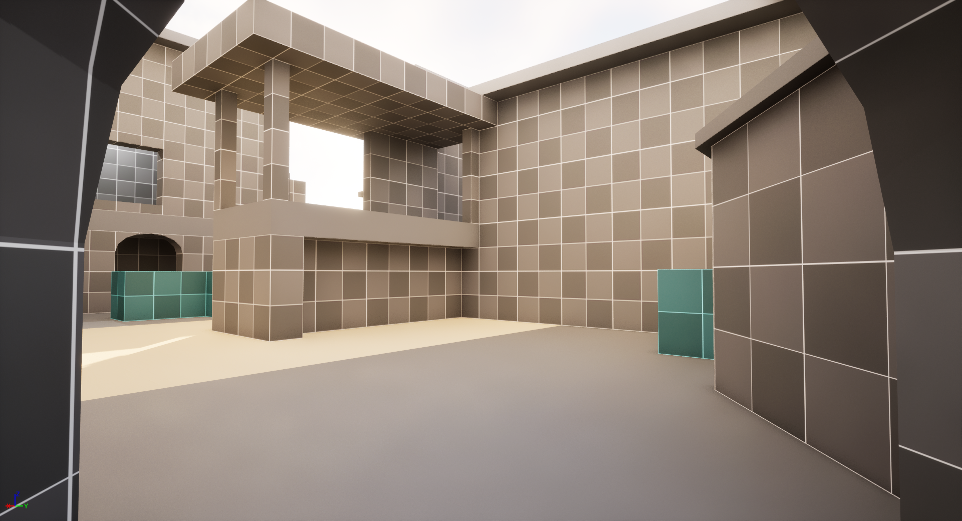
B Site
B site became the clearest place to study design purpose. Early in the blockout, I placed several elements because they looked interesting, but I had not fully justified what they were doing for gameplay.
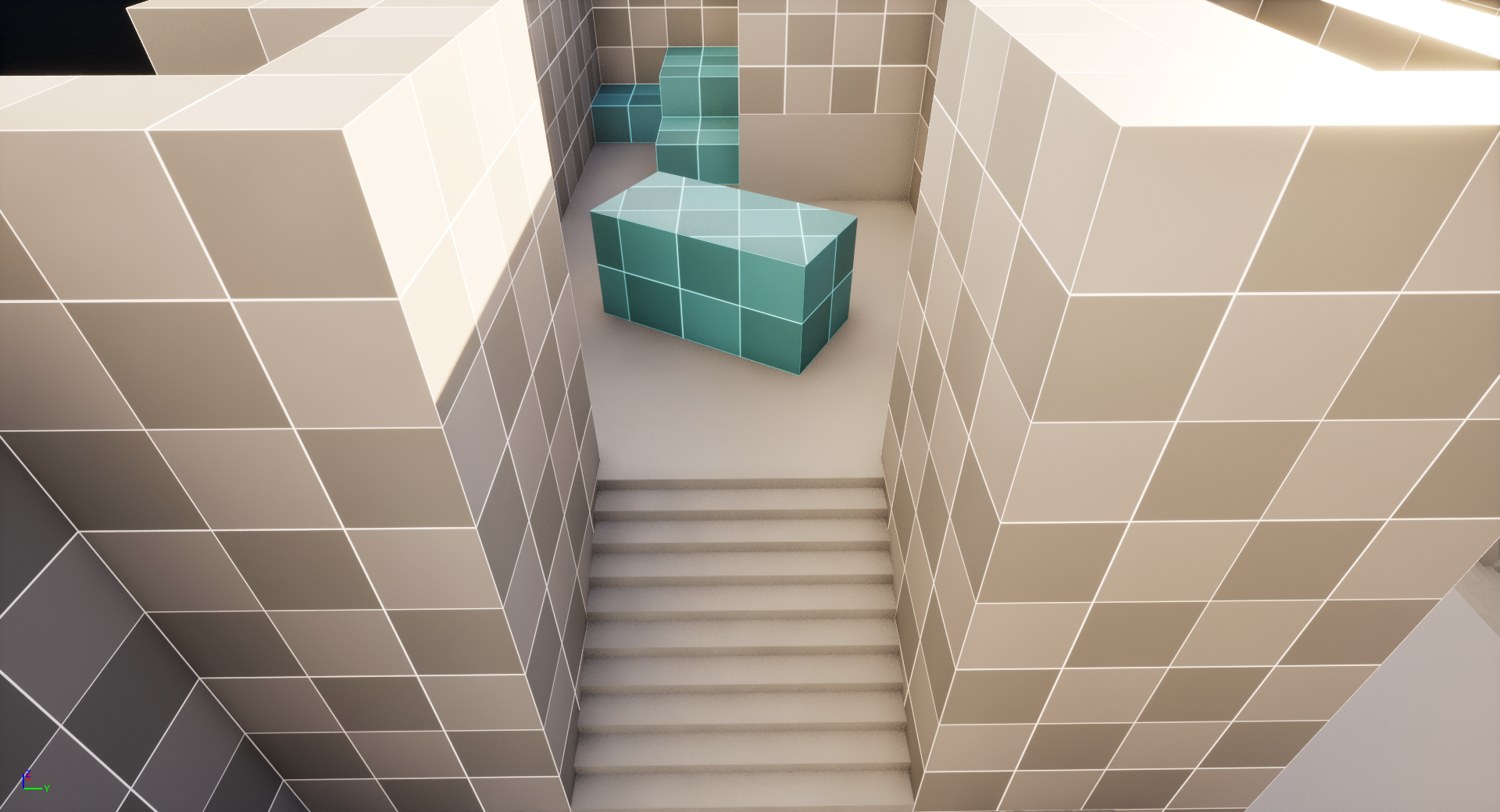
The attacker entrance into B site is a good example. In the first version, attackers entered vertically using a rope from a narrow alley. It looked cool, but the gameplay cost was obvious: only one attacker could enter at a time, and that player was exposed before the team had meaningful options.
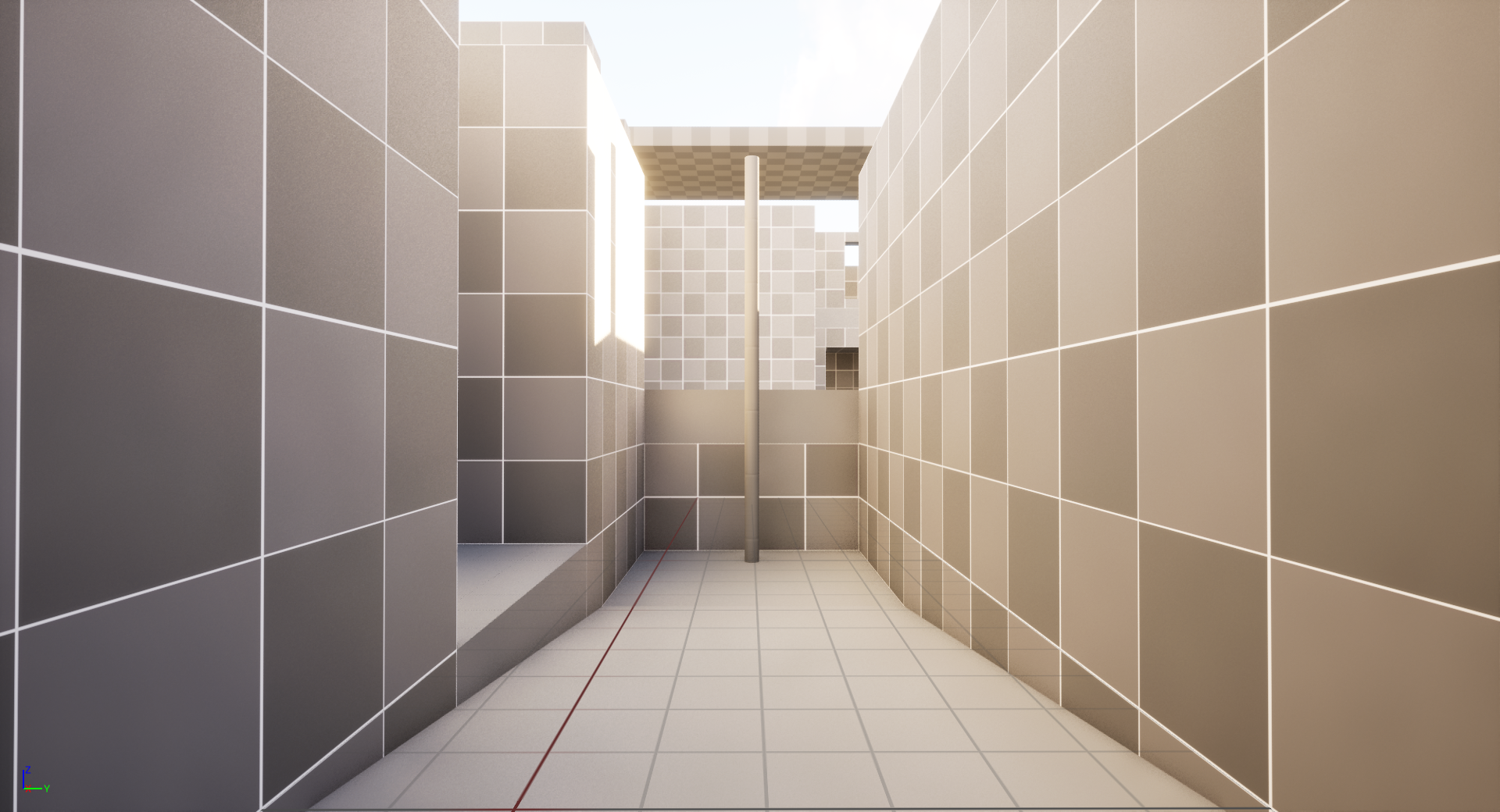

To fix it, I kept the elevation change but replaced the rope approach with stairs before the entrance. I also angled the entry so attackers were not immediately exposed to as many defender positions at once.
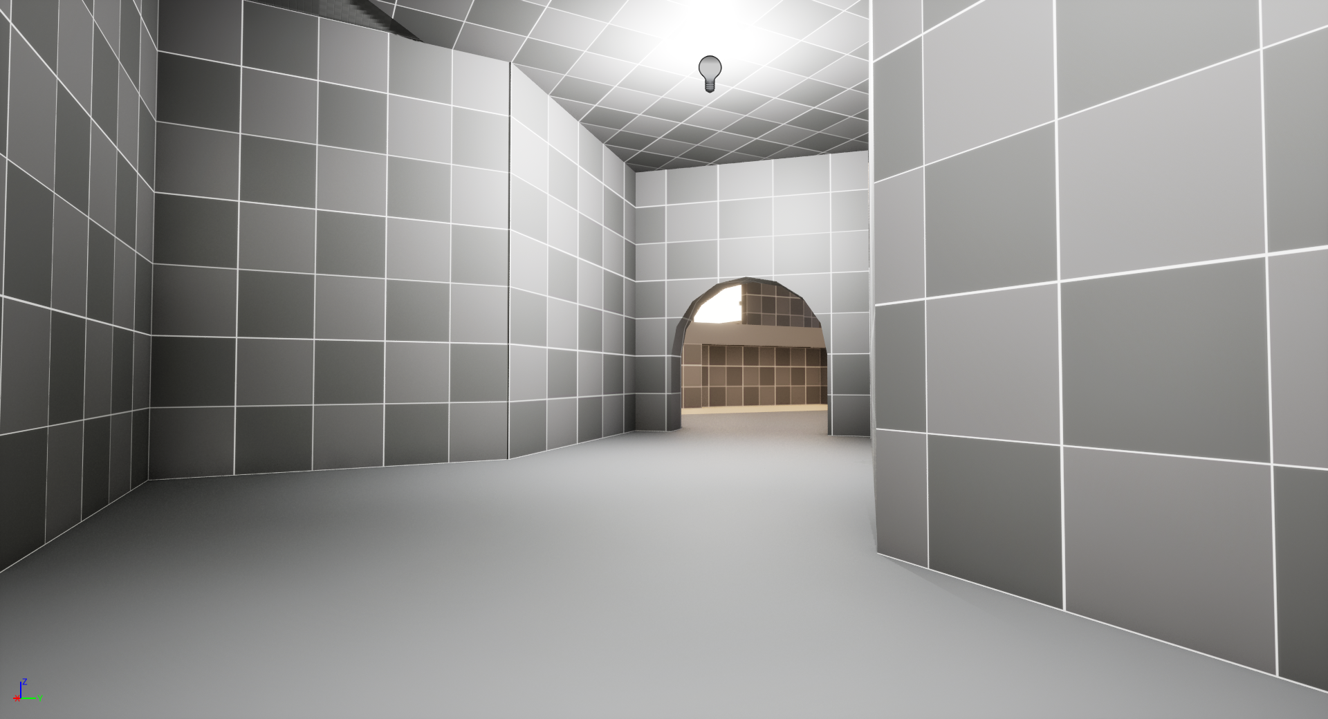
The lesson was not “never make cool entrances.” It was that a cool idea still needs a design purpose. If the entrance creates a bad fight, limits team movement, or gives one side too much information for free, the visual idea is not enough to keep it.
Metrics
B site also exposed a bigger issue with scale. My combat spaces were too compressed for the kind of tactical shooter I was referencing. I knew something felt wrong, but I needed to compare it against proven examples before I understood why.
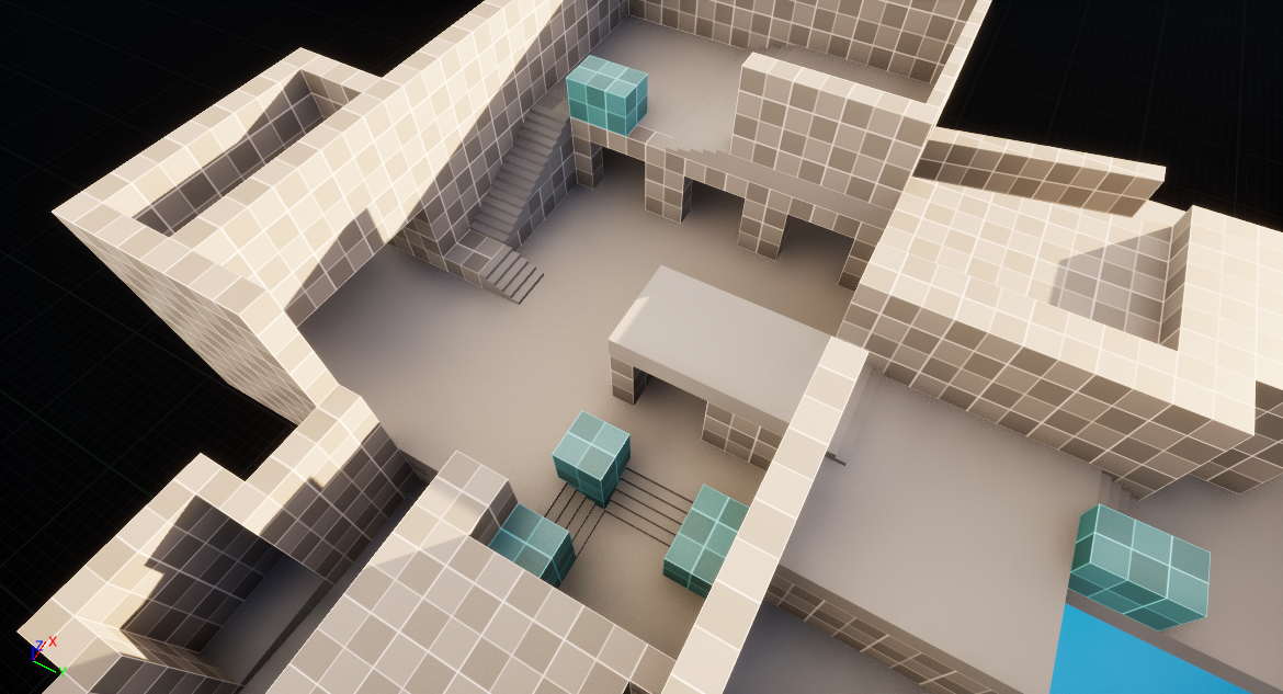
After checking Valorant’s site metrics, I realized my site needed significantly more room for player movement, utility usage, crossfire setup, and no man’s land between key pieces of cover. The original space was trying to hold the same strategic decisions in a much smaller footprint.
The fix was less about making the site larger for its own sake and more about giving players enough room to make readable decisions.
Cover And Heaven Control
The staircase to heaven had another problem: it created pressure, but it did not create fair pressure. I wanted attackers to work for heaven control, but the first version did not give them enough cover or enough meaningful staging space.
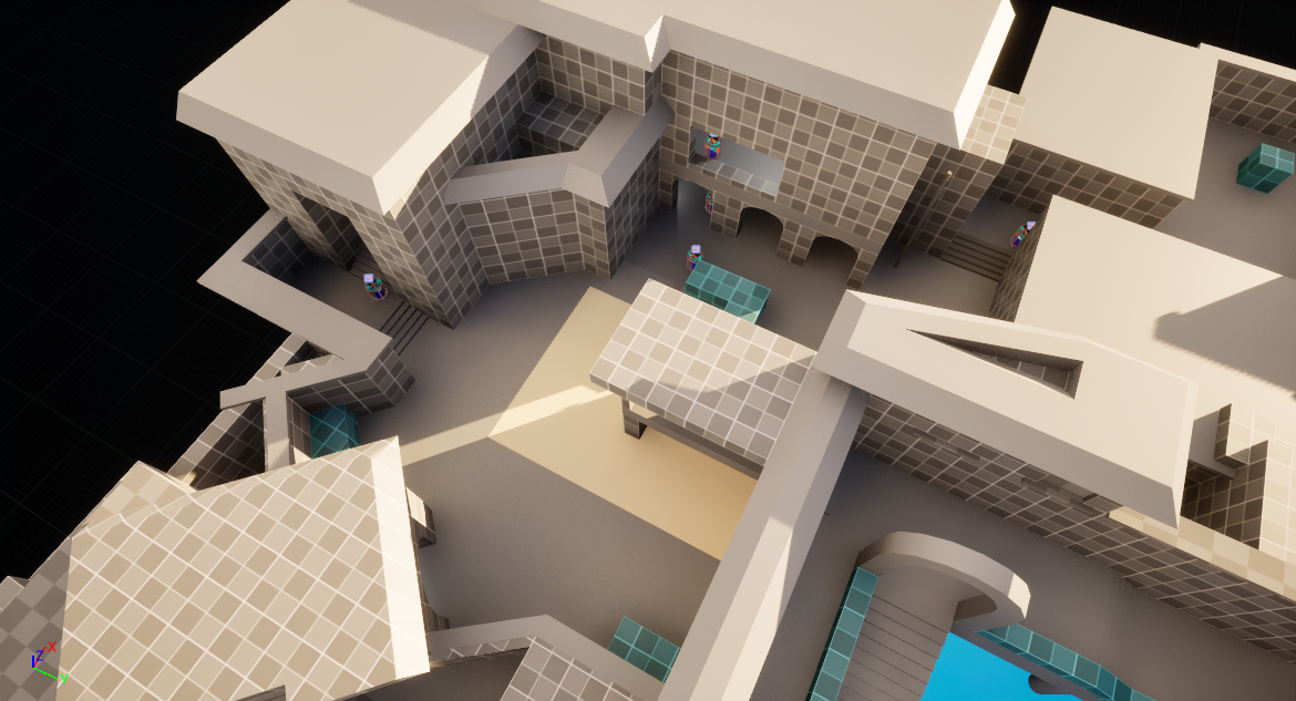
To improve it, I added a new route that still required commitment. Attackers had to cross open space, clear the site, or spend utility before they could safely pressure the heaven entrance. That kept heaven valuable without making the approach feel impossible.
I also added a defender fallback room, which gave defenders a place to reset and continue contesting B site. During review, I removed a box from that room because it created an unfair headclip angle against attackers entering the space.
That small change was a useful reminder: cover is not automatically good. Every piece of cover changes what information players get, how much of their body is exposed, and whether a fight feels earned or cheap.
Takeaway
This map taught me to spend more time proving the design before polishing the space. A strong 2D layout helps catch problems while they are still cheap to change. Metrics keep combat readable. Cover needs a purpose. Routes need to support team movement, not just look interesting.
The next time I build a tactical shooter map, I want the early process to be more deliberate: define the experience, test it in layout, block it out with metrics in mind, then iterate based on how the space actually plays.